A Brand Identity That Looks Like You – and Feels Like Trust

We design brand identities that do more than look nice. They position you, differentiate you, and build instant credibility with the people you want to reach.
Gradient banner background with purple and black tones (compressed)
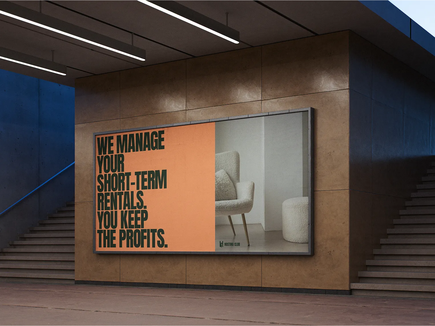
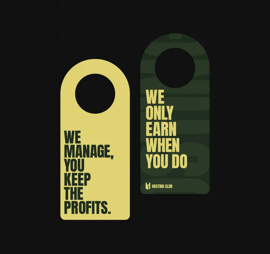
Hosting Club bento-style graphic: “We only earn when you keep profits”

Yellow bento card with Hosting Club logo

Dark green bento graphic with Hosting Club H logo (compressed)
Bento grid showing before/after website visuals
Hosting Club bento-style graphic: “We only earn when you keep profits”

Dark green bento graphic with Hosting Club H logo (compressed)
Yellow bento card with Hosting Club logo
Trusted by some revolutionary brands

Your Brand Isn’t Just a Logo. It’s a First Impression

Your website should work as hard as you do—earning trust, guiding decisions, and driving results.
Clutch review badge with 4.9 out of 5 stars rating

Trustpilot 5-star rating badge, showcasing client reviews
01
Be recognized—instantly
A distinct visual system sets you apart in a sea of sameness.
02
Make trust visible
People trust what feels considered, cohesive, and confident.
03
Create consistency across channels
Your social media, website, proposals—it should all speak the same language.
04
Turn perception into positioning
Visual identity shapes how people understand your value before they read a word.
05
Build something that lasts
A great identity doesn’t just look good today. It grows with your business.

What’s Included in a Brand Identity Package

It’s not just a logo. It’s your brand’s entire first impression—done right.
Stacked layer icon in purple for layout or content management

Logo System

Primary logo, variations, and mark design
Purple icon with layout ruler, representing design tools

Color Palette & Typography

Visual tone that reflects your positioning
Grid icon in purple circle symbolizing structure and UI systems

Design System & Layout Guidelines

Structure for web, social, print, and content
Sparkling star icon representing polish, quality, or delight

Visual Language

Style direction for imagery, iconography, and expression
Purple icon representing branding with framed layout

Brand Style Guide (PDF)

Clear documentation to ensure consistency across all touchpoints
Purple circle with white plus sign icon

Optional Add-ons:

Business cards, social templates, presentation design, etc.

Is a Strong Brand Identity the Piece You’re Missing?

Checkmark inside a circle icon indicating approval or confirmation
You’re launching a new business or offer and want to look credible from day one
Checkmark inside a circle icon indicating approval or confirmation
You’ve outgrown your old logo and brand visuals
Checkmark inside a circle icon indicating approval or confirmation
You feel confident in your service—but your branding says otherwise
Checkmark inside a circle icon indicating approval or confirmation
You want consistency across digital and print
Checkmark inside a circle icon indicating approval or confirmation
You want to invest in something timeless, not trendy
Futuristic glass blocks in purple-blue lighting

What They Say About Us

Lohnpartner

What was the problem?
We didn’t have a professional website, and that was becoming a problem. Clients couldn’t find us online, and when they did, our site didn’t reflect the level of service and expertise we actually deliver. It felt outdated and basic.
What changed after working with us
Franz Digital came in and built us a premium website from the ground up. It’s clean, modern, and communicates exactly who we are. Now, when people visit our site, they immediately understand the value we bring. It’s a game-changer for how we present ourselves.

Lohnpartner

What was the problem?
I had a WordPress website that looked like it was stuck in the past. It didn’t match my brand anymore, and I wasn’t proud to share it. There was no real structure, and it didn’t feel authentic to my work as a speech coach.
What changed after working with us
Franz Digital designed a fully custom Webflow site that feels like a true reflection of who I am. They helped me define my branding and even used real photos that bring personality and trust. It’s not just a website—it’s my digital identity now.

Lohnpartner

What was the problem?
We were using a basic WordPress template that didn’t capture the warmth, tradition, or quality of our bakery. It looked generic, lacked visuals, and didn’t represent the experience of visiting us in person.
What changed after working with us
Franz Digital created a Webflow website that finally shows who we are. With beautiful visuals, videos, and a layout that tells our story, the new site feels alive. It’s inviting, it’s functional, and it truly represents our brand. We finally have a website we’re proud of.

Lohnpartner

What was the problem?
We didn’t have a professional website, and that was becoming a problem. Clients couldn’t find us online, and when they did, our site didn’t reflect the level of service and expertise we actually deliver. It felt outdated and basic.
What changed after working with us
Franz Digital came in and built us a premium website from the ground up. It’s clean, modern, and communicates exactly who we are. Now, when people visit our site, they immediately understand the value we bring. It’s a game-changer for how we present ourselves.

Lohnpartner

What was the problem?
I had a WordPress website that looked like it was stuck in the past. It didn’t match my brand anymore, and I wasn’t proud to share it. There was no real structure, and it didn’t feel authentic to my work as a speech coach.
What changed after working with us
Franz Digital designed a fully custom Webflow site that feels like a true reflection of who I am. They helped me define my branding and even used real photos that bring personality and trust. It’s not just a website—it’s my digital identity now.

Lohnpartner

What was the problem?
Herwig came to us with a WordPress site that felt outdated and off-brand. It didn’t reflect the clarity and professionalism he brings to his work as a speech trainer. The content was scattered, the design didn’t feel trustworthy, and the whole experience just didn’t feel like him.
What changed after working with us
We started from scratch and created a custom Webflow site with structure, purpose, and polish. We brought in real photos, refined the brand tone, and designed a site that feels clean, confident, and easy to navigate — just like Herwig’s own communication style.
Transparent ellipse shape used for layout or visual layering

Particle dot pattern SVG for subtle animated background effects
0
1
2
3
4
5
01

Discovery & Brand Insight

We get clear on your positioning, audience, and vision

02

Moodboarding & Direction

Exploration of aesthetic styles and tonal direction

03

Concept Development

Logo drafts, color palette exploration, typography suggestions

04

Refinement & Finalization

One concept selected and refined with you

04

Delivery & Guidelines

Final assets, export files, and your brand guide